
This is a very old post (2006), written by Sven Noben, founder of Signfuse. Several data (and links) in this article may be outdated.
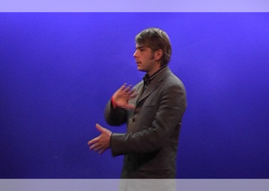
Whenever I am surfing the internet for sign language video’s, such as SignStation, I’m getting lots of messages against a flashing blue background, called blue key.
This is kind of annoying me, but also surprising me. It seems that, for some, if you want to be serious about sign language media, you need a blue background.
However, the color blue as it appears in blue key screens, is meant to create the highest contrast possible with the human body. And exactly this high contrast is annoying my eyes.
Blue key screens are meant to be replaced with another image, for example of a forest or a weather map.
Even though, when people are creating a message in sign language, the myth exists that it should be filmed against such a blue screen.
Is it because deaf associations order a small studio and then find a blue screen in it, and then imagine they should use it?
It is appealing that in some countries the blue screen is used effectively (replaced by another image) and others don’t. And it is appealing as well that those countries who replace their blue-screen by another image are often strong DEAF-AWARE countries, such as the USA, Finland or Sweden.
What the hallway is for a house, is the background for a video. It makes the first impression and tells us more than you’d think.
In the first place, the background in a video tells us where the signer is located. In the city, a forest or at work.
When we see a signer against a blue screen, he’s obviously in a studio.
I don’t think the viewer wants a window on a studio, he’d rather like a window through the studio to another world.
It’d be much nicer if video’s that don’t need the blue backdrop would opt for a softer color (have a look at the curtain section of your local store). Or try to film the video against a real background, one that suits the context.
Don’t be afraid to experiment outside in your backyard, take the studio-lights to the office or go to the forest nearby.
But always make sure that there IS enough contrast between the skin-color and the background. Otherwise you’ve just jumped to the other side of the river.