
This is a very old post (2006), written by Sven Noben, founder of Signfuse. Several data (and links) in this article may be outdated.
VIA has come with a revolutionary new website for Finnish Sign Language users.
We benchmarked it and used our hammer on this diamond, but it seemed almost rock-solid. Almost…
First I’d like to say in this review that I am very, very happy that Via, an interpreting office in Finland, has chosen to make their website accessible for Finnish Sign Language users.
I would advice any Sign Language Interpreting organization in the world to follow their footsteps, as Sign Language is their core business, and Sign Language users their customers.
The design of the Via website is very fresh, futuristic and appealing. It feels like a wink to virtual reality, in -The Matrix- style. A lot of new ideas have been implemented, which of course will inspire SignFuse and many others to create even better media in the future.
Have a look: Via Website (opens in new window)
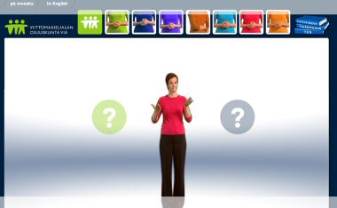
When entering the site, the design is very clear. Avatars {?} are signing at a very nice pace. They don\’t sign all at the same time, so the eye doesn\’t get overloaded. The user gets control over which avatar {?} signs, by hovering the mouse over the it.
Interpreter shirts have different colours, putting the eye candy right where it belongs. Buttons on top of the main window repeat the same colors again. But it would have been nice to see a face in the button too. No face, no mimics, no intonation. Mimics are anyway an integral part of sign languages.
Browsing the site for a while, the sleek white background is making eyes tired. A softer colour would help.
For some more extended topics, one can select a subchapter. This is very useful when one needs to search or skip content.
A very revolutionary introduction in this new website, from my perspective, is the multiple choice feature (see screenshot on top). It uses the 3D space of sign language to set both options, very smart!
But it could be finetuned. It should have the option to have the question repeated. Visitors aren’t always very concentrated. Also a back-button in case you want to pick the other choice would be great.
Spoken about back-buttons, the browsers back-button has absolutely no use on this website, it reloads the whole thing.
This violates the rules of usability, every internet-user loves it’s browser’s back-button.
Even worse, when you try to navigate away from the site by going back, you are locked. That’s the most sad note I have to make on this beautiful site.
After all, it is great that no text has been used, unless absolutely neccessary. For example adresses are displayed nicely in text, much better than fingerspelling them. Good choice!
But the most brilliant feature is undoubtly the contact feature where one can send a message very easily over webcam. Yours to check it out!
I give it a huge 8/10 – the second best website created by a non-Deaf webdesign company I have ever seen, after Websourds.
Sites:
- www.via-ok.net (opens in new window)